

Colours in interiors
Choosing the right colours is such an overwhelming experience nowadays. We have too much choice and it is increasingly difficult to pick the right shade for walls, floors and decorations.
You can start by thinking “vertically”. If you think the world has darker colours for the ground and lighter colours for the sky, you can work your rooms the same way by starting from dark and going lighter towards the top.
How to find your colour? You probably have something in mind but before you make your final decision read the tips below.
Colours can be used to link areas of your home together. For example, if you have a green sofa in a room you could have some green accessories in the next room.
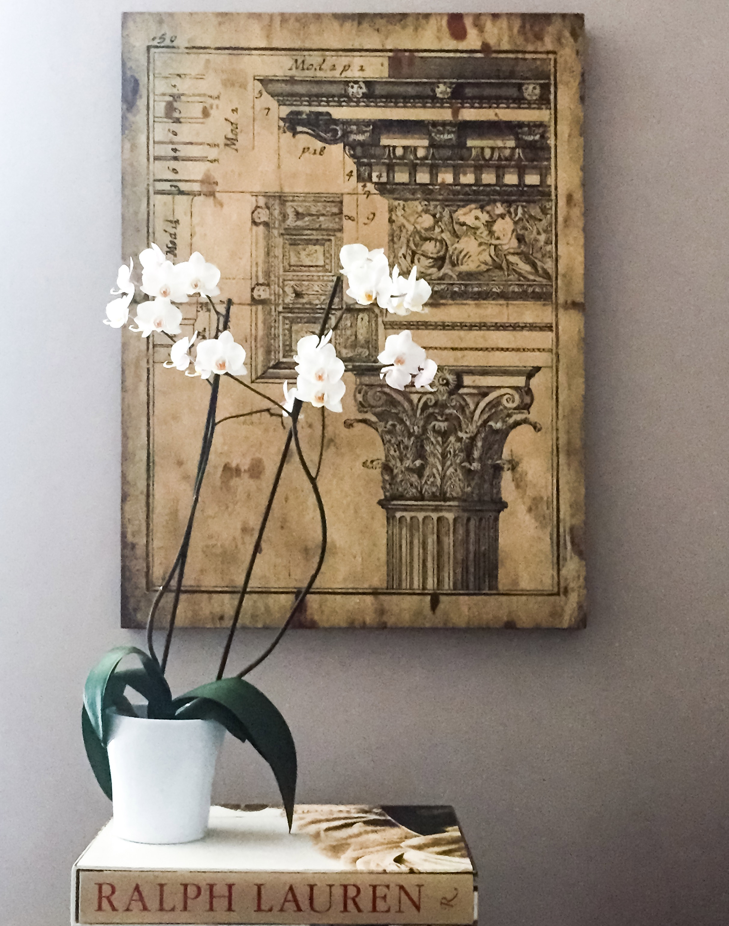
Once you have read the meaning of the colours and where best to use them, the next step is to create the right balance between walls, furniture, materials, patterns and textures, making sure their combination makes for a beautiful living space. These, complemented with different heights, will add interest and movement in the room.
The right balance is your taste; how much pink is too pink? You will need to work the room until it looks beautiful and feels comfortable.
Have fun with your next “colourful project” and get in touch to share or ask any advice.
Trade secret
One of the rules we use is 60/30/10.
Walls – 60% of colour
Floor – 30% of colour
Accessories 10% of colour


Mood & Colours
Colours can elicit a variety of emotions and affect the mood.
RED – The colour of blood and fire, is associated with irritation, danger, heat, joy, vibrancy, stimulation and power. A popular choice for kitchens, dining rooms and restaurants, it is known to increase appetite and generally used in areas where you eat. You want to choose a colour that is associated with food, something that stimulates your senses for your next meal.
BLUE – Evokes loyalty, trust, calm and integrity. There are so many different shades of blue and, depending on the tone you use, you can create a different mood in the room. When using strong blues look at your lighting scheme and don’t forget to add texture to avoid a cold feel. Light shades of blue will give a sense of serenity and bright blue will give an invigorating look. The most common use of blue is in the monochromatic colour scheme where you combine blue of different shades to create a perfect calming space.
YELLOW – A bright colour that stimulates our mental faculties and activates our analytical brain. It creates enthusiasm for life and relates to optimism and expression of new ideas, but it can also produce anxiety. I would use yellow in hallways or a breakfast corner, and mostly use it as an accent colour for interiors.
ORANGE – A warming colour that will make your home more inviting. Uplifting and optimistic, orange stimulates adventure and sociability and looks great when used in social areas such as pubs, kitchens and playrooms. If you find it too bright you can use pastel shades of orange for your decor.
BROWN – It is a serious colour; down-to-earth and provokes stability, practicality and support. In interiors, it can be a little predictable but if used correctly it is a glamorous base for other colours as pink, yellow and orange.
BLACK – Always chic. To add depth to a room, use black. The secrets, the unknown and the mystery; it offers protection and comfort and is considered strong, formal and sophisticated, but also pessimistic and at times depressing. It provides a great contrast and a luxurious look when teamed with white, gold, silver, brass and metallic.
WHITE – The innocence, cleanliness, simplicity and purity which in interiors can also be sterile, empty and too cautious. It works well in areas where cleaning is prevalent, such as bathrooms. It reflects light so it has an expansive effect on spaces. Ideally, I would use it with other colours to achieve a high-contrast look.
PINK – A feminine, gentle, calming colour usually associated with kids' rooms. It can be used to create sophisticated and chic interiors, especially when combined with contrasting colours such as blue and greens.
PURPLE – Here is the colour of good taste, imagination and spirituality. If used in the wrong setting it can look pompous and too imperious but in areas where creativity is required, it works perfectly. If you want to create a sophisticated and modern look you can use a few shades of purple with white, grey, brown and a hint of black.
3 tips related to this topic
Tip one.
Consider both artificial and natural light in the room and always buy a small sample of paint and observe the colour at different times of the day with different lights. Choosing the right colour requires a lot of thinking and planning so don’t rush into it.
Tip two.
Consider the colour of any existing furniture and to play it safe, limit your palette to just three colours.
Tip three.
Don’t follow trends, choose a colour you like which reflects your personality. Think of the period of your home and the mood you wish to achieve in each room.


